A small room can feel like a closed box fast. The good news is that paint changes how your eyes read light, distance, edges, and even ceiling height.
You don’t need to knock down walls to get a better result. With the right color, finish, and placement, a tight room can feel calmer, brighter, and more open.
The trick is knowing what helps space feel soft and what makes it feel chopped up.
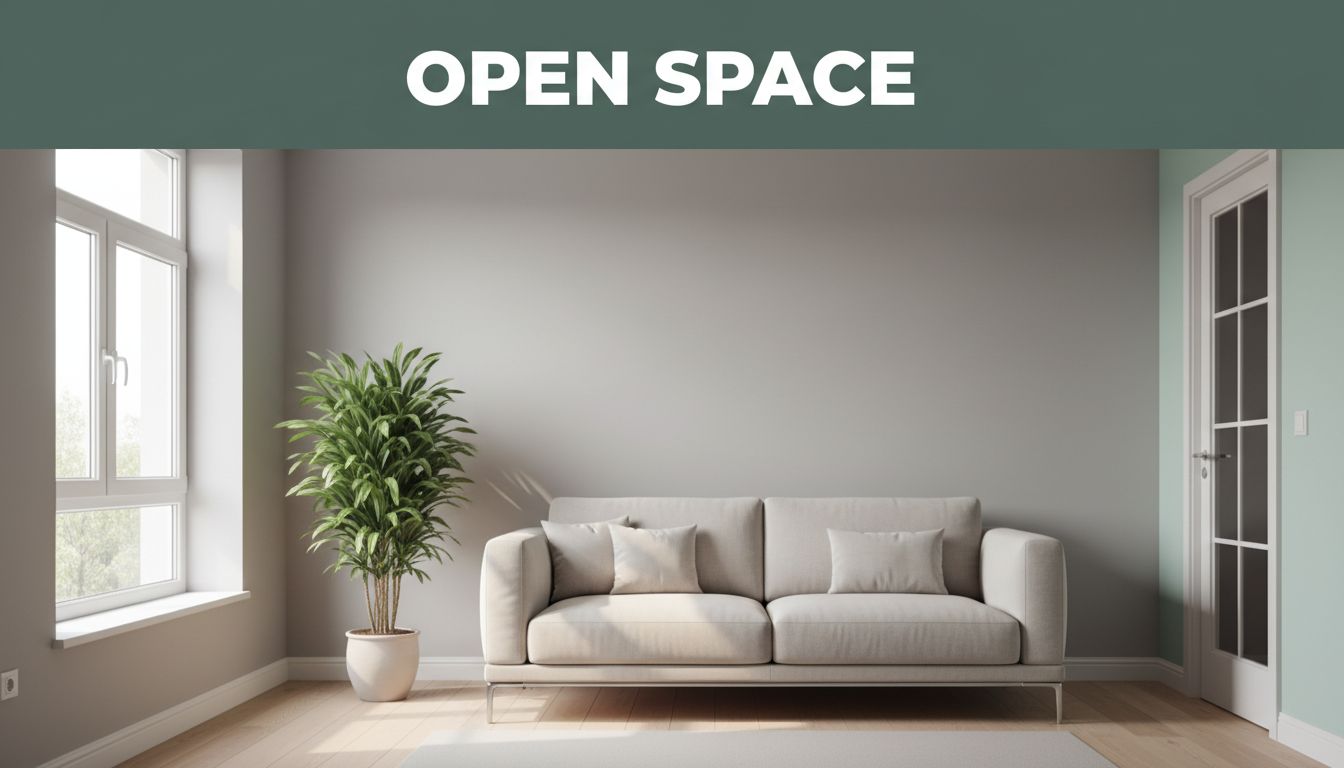
Choose paint colors that open up the room instead of closing it in
If you want to make a room look bigger with paint, start with light-reflective shades. Lighter colors bounce natural and lamp light around the room, so walls seem to sit farther back. That simple shift makes the room feel less crowded.
For 2026, the strongest small room paint colors lean soft and warm. Think warm whites, soft grays, mushroom neutrals, sandy beige, dusty blush, pale mint, and hazy blue. These tones feel current without chasing a short-lived trend. Dark, heavy colors still have a place, but they usually work better as accents than full-room coverage in tight spaces.
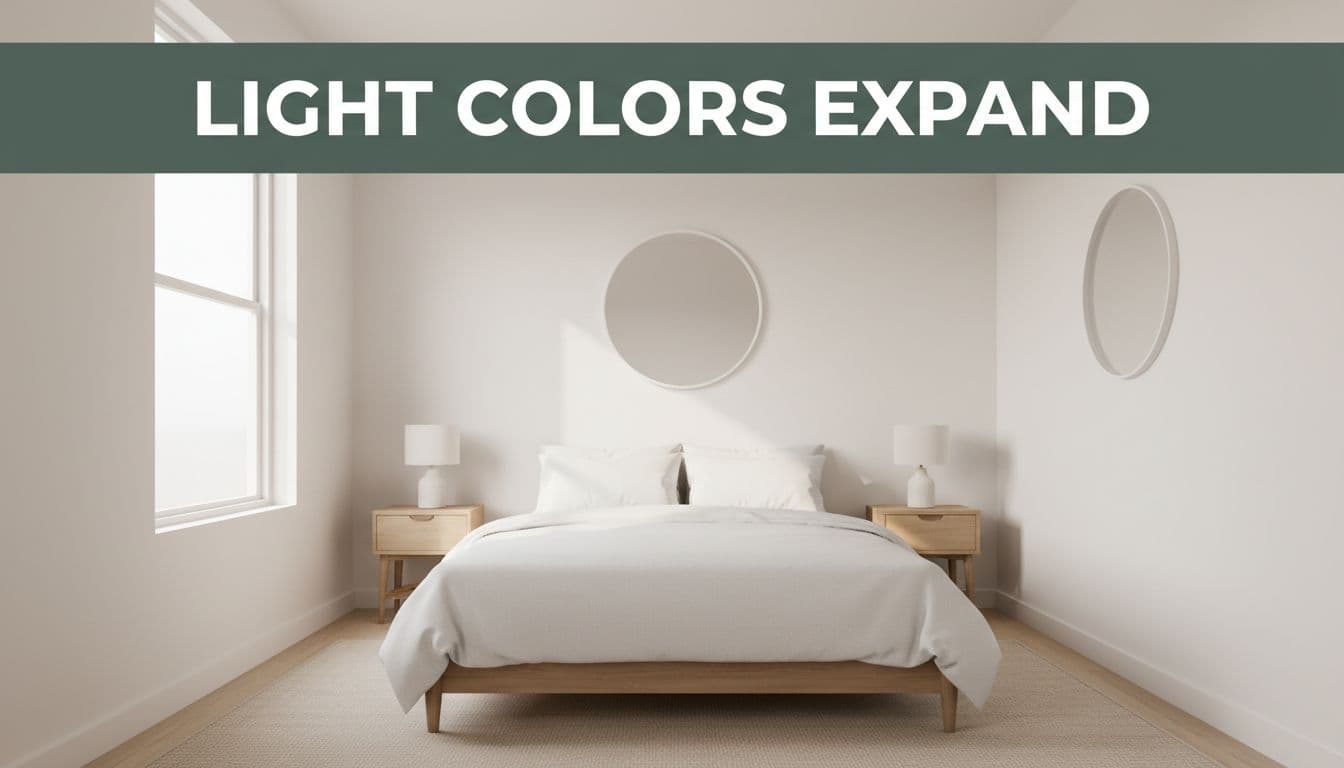
Why high-LRV colors help small spaces feel brighter and larger
LRV stands for Light Reflectance Value. In plain English, it tells you how much light a paint color reflects. The higher the number, the more light it kicks back into the room.
When your goal is openness, look for shades with an LRV over 70. That range often includes airy whites, pale greiges, and soft tinted neutrals. If you want a quick primer, this simple explanation of LRV paint colors breaks down why the number matters more than the color name.
A paint chip called “cloud” or “linen” can still dry darker than expected. So test large swatches on two walls and check them morning, afternoon, and night.
The best light paint colors for bedrooms, living rooms, and home offices
The best paint colors for small rooms depend on how you use them. A bedroom should feel quiet. A living room should feel easy and open. A home office should stay bright without glare.
This quick guide helps narrow the field:
| Room | Color family that works well | Why it helps |
|---|---|---|
| Bedroom | Warm white, dusty blush, hazy blue | Softens edges and feels restful |
| Living room | Mushroom neutral, sandy beige, pale greige | Adds warmth without looking heavy |
| Home office | Soft gray, pale mint, muted blue-gray | Feels fresh and focused |
That doesn’t mean every small room must be white. A pale color with a gentle undertone often feels richer and more lived-in. If you want more inspiration, these paint colors that make any small room look bigger show how subtle tints can still read open.
Use one color in smart ways to blur edges and stretch the space
Color choice matters, but placement matters just as much. In a small room, every sharp contrast acts like a stop sign for the eye. If you reduce those stops, the room feels smoother and wider.
That is why a light version of color drenching works so well in compact spaces. You don’t need a moody designer room to use the idea. In most cases, a soft, cohesive palette does more for a tiny room than a bold statement wall ever will.
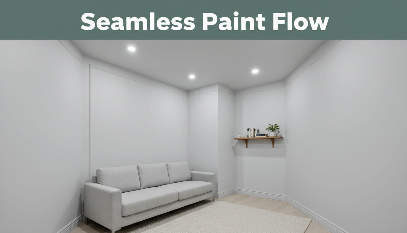
Paint the walls, trim, and ceiling the same shade for a seamless look
Painting the walls, trim, doors, and ceiling the same color removes visual breaks. Instead of reading each edge as a hard boundary, your eye moves through the room in one sweep. That helps boxy rooms, narrow hallways, and low-ceiling spaces feel less boxed in.
Designers keep returning to this trick because it works. You can see examples of painting walls and trim the same color in rooms where heavy molding or lots of doors would otherwise feel busy.
If you want more space, give the eye fewer places to stop.
Use the same finish everywhere if you want the calmest look. Or keep the color the same and shift the sheen slightly on trim if you need extra wipeability.
When a slightly lighter ceiling can still help the room feel taller
Not everyone wants a fully matched room. That’s fine. A ceiling painted one step lighter than the walls can still help a room feel taller, as long as the shift is soft.
Choose the same-color approach when the room feels choppy, dark, or unusually narrow. Pick a slightly lighter ceiling when you want a little lift but still like a classic look. The big point is this, keep the contrast low. A stark white ceiling above deeper walls often draws a hard line across the room.
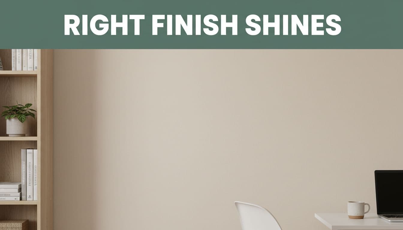
Pick the right finish so light works for you, not against you
Finish changes more than shine. It affects glare, how smooth the wall looks, and how restful the room feels. In small rooms, that matters because every reflection and flaw becomes easier to notice.
Right now, many painters and designers favor matte or soft, chalky-looking finishes on light neutrals. They soften light and hide wall issues better than shinier options in many small bedrooms, offices, and living areas.
Matte, eggshell, or satin, what works best in a small room
Matte gives the softest look. It hides dents, patches, and texture well, so walls look quieter. That’s a strong choice for adult bedrooms, ceilings, and lower-traffic rooms.
Eggshell is the middle ground. It has a low sheen, wipes more easily than matte, and still keeps glare under control. For many homes, it’s the safest all-around wall finish.
Satin reflects more light, but that doesn’t always help. In a small room, extra shine can highlight every bump. Still, satin makes sense in kids’ rooms, hallways, or any space where walls take more abuse. This interior paint sheen guide is a good reference if you’re stuck between eggshell and satin.
How wall prep and smooth coverage make the room look more polished
Even the best color can’t hide sloppy prep. Dust, grease, dents, and roller marks make walls look restless. In a small room, that busy surface can make the space feel smaller.
Start by cleaning the walls. Patch nail holes and dents. Sand rough spots. Then use two thin coats instead of one heavy one. Thin coats level better, dry more evenly, and leave fewer streaks.
A polished wall reads as one clean plane. That calm surface helps the room feel bigger, even before you move furniture back in.
Avoid common paint choices that can make a small room feel even smaller
Some paint ideas look exciting on social media but fight the goal of openness. The main problems are dark all-over color, sharp contrast, and trendy placement that cuts the room into pieces.
That doesn’t mean you must play it safe. It means your choices should support the room’s shape, not argue with it.
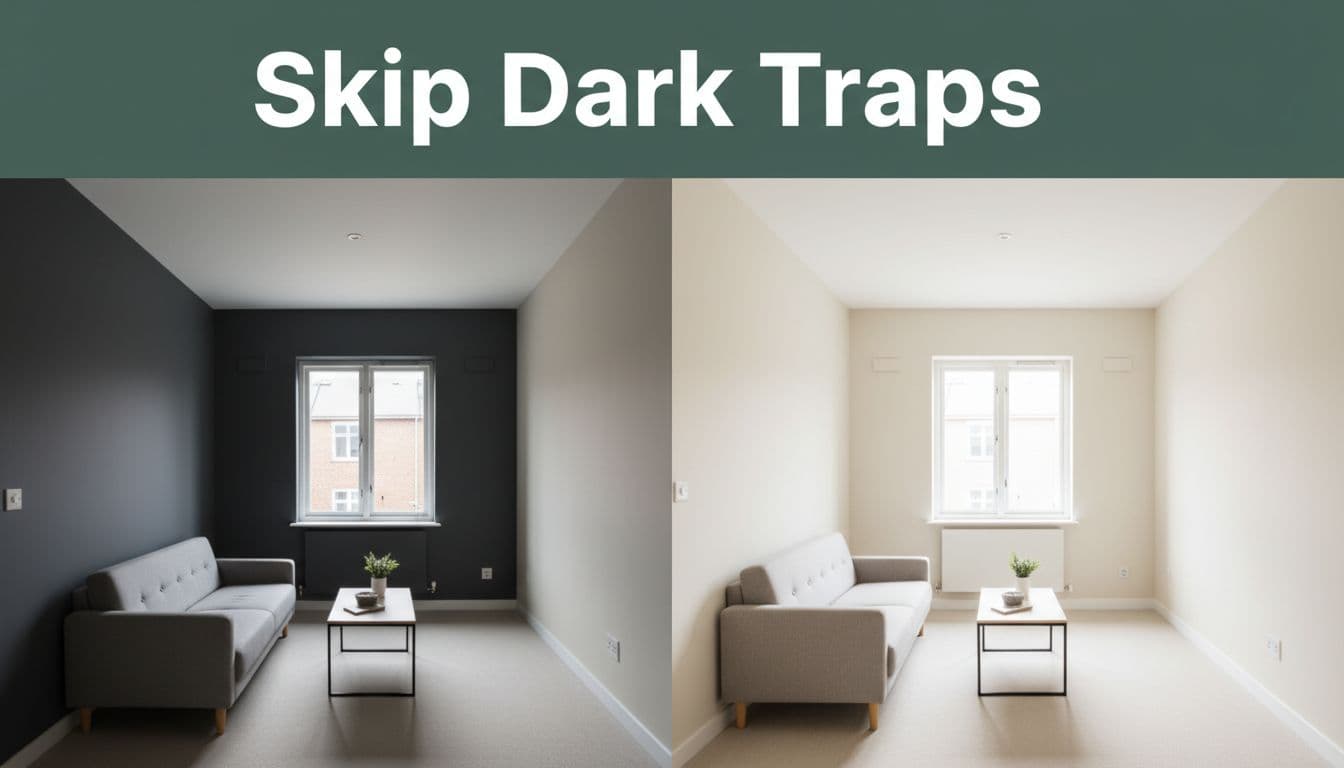
Why strong contrast between walls, trim, and ceiling can chop up the space
Contrast makes boundaries stand out. That sounds harmless, but in a small room it can turn every edge into a hard line. Dark walls with bright white trim, or mid-tone walls under a stark ceiling, can make the room feel shorter and tighter.
A softer palette does the opposite. Similar tones blur the room’s perimeter, so it feels less segmented. Many designers flag contrast as one of the paint mistakes that can make your home look smaller, especially in compact rooms with lots of trim.
If you like contrast, use it in decor instead. Pillows, art, and wood tones can add punch without shrinking the shell of the room.
Accent walls, color blocking, and color capping, what to skip and what to use carefully
Accent walls can work, but they need restraint. A deep navy wall behind a bed in a tiny bedroom often pulls that wall forward, which makes the room feel shorter. A better move is a subtle tonal shift, or a painted nook behind shelves in a shade close to the main wall color.
Color blocking can also work if the contrast stays gentle. Think pale beige with a slightly deeper mushroom, not white against charcoal.
Color capping is the one trend to treat with care. When you carry wall color across the top portion of the wall and onto part of the ceiling line, it often lowers the feel of the ceiling. In a tight room, that can make the space feel compressed. Save that look for larger rooms with more height to spare.
A cramped room doesn’t need drama first. It needs breathing room.
A small room can feel larger with paint when you pick light-reflective colors, keep the palette cohesive, and soften the lines between walls, trim, and ceiling. The biggest win usually comes from reducing contrast, not adding more of it.
If your room feels tight today, start with one weekend project. Test a few high-LRV shades, choose a low-sheen finish, and keep the edges calm. A smart coat of paint can make the room feel brighter, taller, and much easier to enjoy.